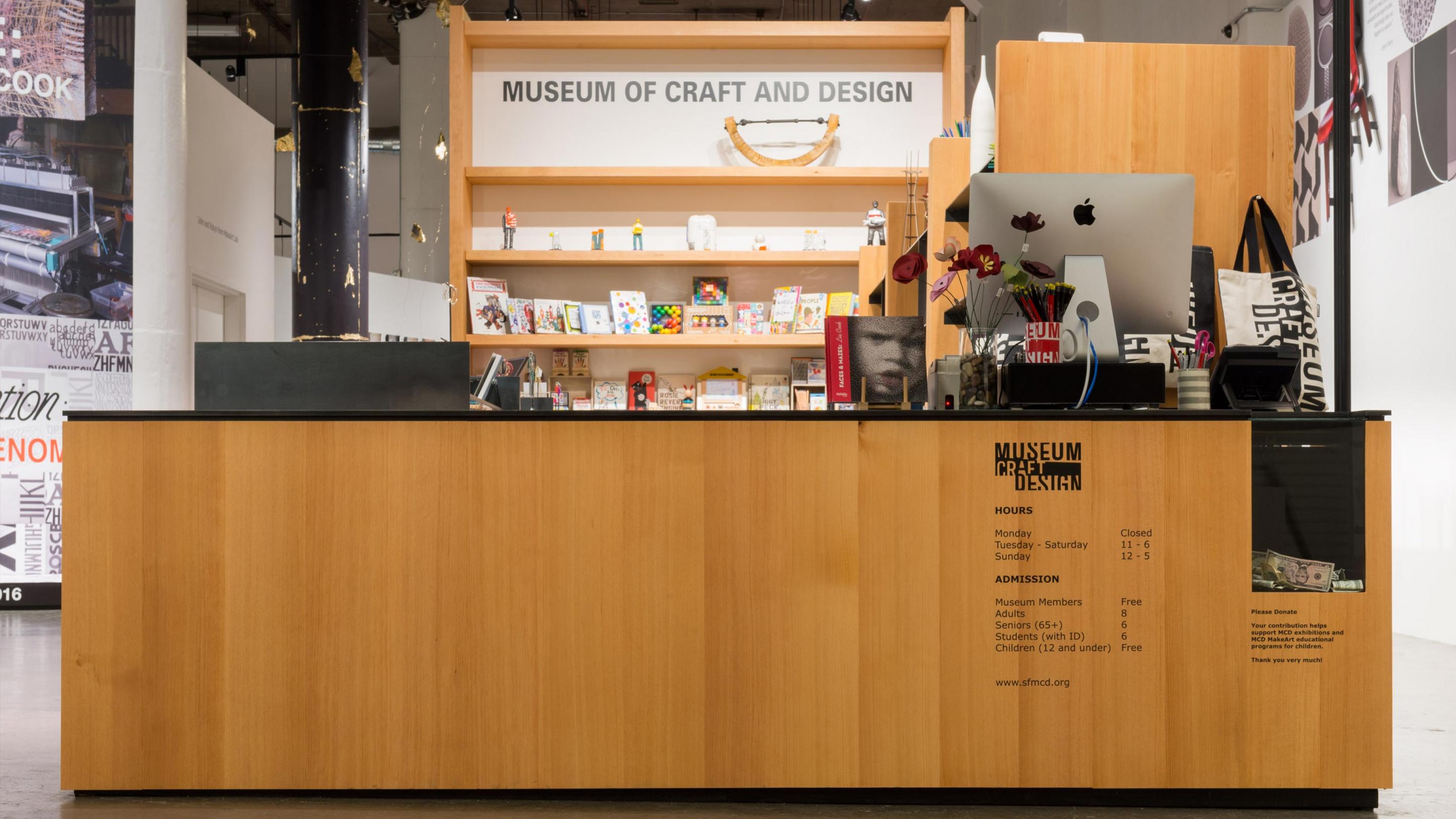
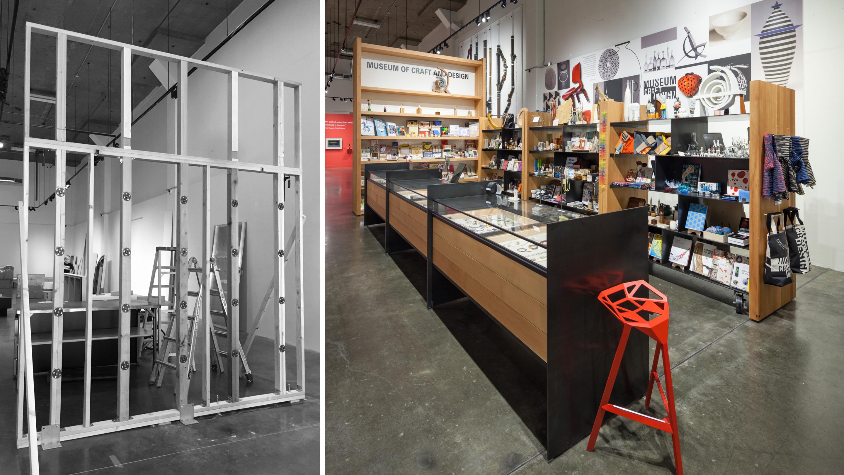
Our friends and neighbors at the Museum of Craft and Design had decided it was time for a facelift for their museum store. Since its inception a variety of fixtures had been added to the mix, resulting in a jumble of varied fixtures that didn't properly represent the museum's commitment to craftsmanship. The goals of the redesign were twofold: to reflect the emphasis on craft in the aesthetics of the store, and to streamline circulation through the space.
The material palette was selected to convey a sense of raw, natural beauty--heavy douglas fir walls and sleek sheets of blackened steel are repeated throughout the space, and the central fixtures were placed on casters to allow reconfiguration for events or different merchandising demands. The store is bookended by a reception desk at the front of the store and a tall shelf wall at the back--the former clarifies the entry sequence to the museum and improves security, and the latter provides a signage opportunity and a visual divide between the store and exhibition areas (as well as supplying additional wall display area for the exhibits).


